KINGSTON, R.I. – July 1, 2021 – Was Socrates a man or a god? How can you remove societal biases from machine learning? How should solitary confinement in prisons be reformed?
Those are just a few of the 11 research projects being tackled this summer by College of Arts and Science Fellows at the University of Rhode Island.
The summer fellowship program funds undergraduates in an Arts and Sciences major to participate in research, scholarly or creative projects under the supervision of a faculty member for up to 10 weeks. This year, the program is awarding $28,000 in stipends supporting approximately 2,400 hours of research for students majoring in such fields as criminology and criminal justice, political science, computer science, and philosophy.
In addition to support from the College of Arts and Sciences RhodyNow Fund and its Dean’s Excellence Endowment, the fellowship program is supported by a generous gift from Bob and Renamarie DiMuccio in honor of President David M. Dooley. As President Dooley retires at the end of July, the DiMuccios wished to recognize his leadership in transforming URI over the last 12 years with a gift to support undergraduate research experiences that visibly impact students and build a pathway for their future success.
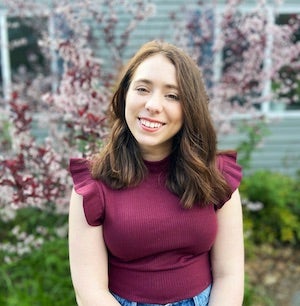
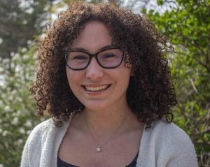
Hannah Beaucaire ‘22, a political science and criminology and criminal justice major from Gardiner, Maine, will spend the summer researching solitary confinement practices in U.S. prisons. Working with Assistant Professor Natalie Pifer, Beaucaire will examine large-scale reforms that her home state is enacting to determine if the reforms should be adopted nationally.
“One of the reasons I was interested in studying solitary confinement was the extreme physiological consequences it has been known to cause,” she said. “For such an extreme practice, I find solitary confinement to be under-regulated.”
The end result of her research will be an online platform that will include short videos providing a history of solitary confinement, its consequences and the reforms Maine is attempting. She plans to use social media to attract interest in the site, which she hopes will serve as an educational and advocacy tool.
“Without the monetary award I would have spent most of my time working a summer job,” she said, “but now I get to use that time to study something I find really exciting.”
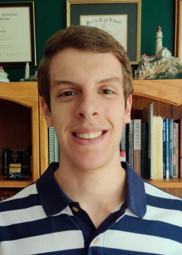
For John Mancini ’22, the summer will be spent reading the dialogues of the ancient Greek philosopher Plato to determine if Plato viewed fellow contemporary philosopher Socrates as a god or a mortal. Plato, who lived from about 428 to 348 B.C., wrote about 35 dialogues. Socrates was a main character in many.
How do you determine someone’s divinity?
Mancini, a philosophy and political science major from Westerly, will look at Plato’s writings to determine what he considered gods and the characteristics of his “Forms,” his theory of the metaphysical structure of the universe. He will also look at secondary sources to answer what makes a person divine, godlike, or a “Form.”
“The Forms are what make things the way they are and so explain what things are in themselves,” he said. “For example, the Form of Beauty is responsible for all things that contain beauty; the Form of Tallness is the reason that some things are considered tall. Plato’s theory basically answers the ‘why’ question: I am beautiful because I partake in the Beautiful; I am tall because I partake in Tallness.”
Mancini will conduct research and discuss his conclusions with Professor Doug Reed, who specializes in ancient philosophy, and plans to write a paper explaining his findings.
“When my findings are published, other philosophers will be able to offer me pushback and constructive criticism,” he said. “This will allow me to better develop my position—should I need to. Philosophy is very much a discussion, and after drawing my conclusions, someone is bound to disagree with me. I welcome any opposition so philosophers can gain a fuller understanding of Platonic dialogues.”
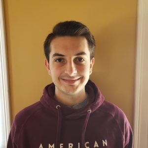
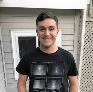
This summer, Jacob Afonso ’22, a computer science major, will be researching fairness and bias in machine learning models, under the supervision of Assistant Professor Sarah Brown. The goal of the project is to test and find ways to eliminate biases from the models.
“In the data used to create machine learning models, societal biases are often present,” said Afonso, who lives in Smithfield. “When using biased data, the resulting model used for any sort of predicting will have those underlying biases.
“I wanted to research this because I believe this is one of the largest areas of machine learning that makes people skeptical of its effectiveness,” he added. “It is also important for the future of equality of all groups of people as the use of machine learning continues to grow.”
Afonso’s research will include reading papers on the topic and learning code libraries, which hold the code for the different machine learning algorithms. He will use those to create and test fair models. Eventually, the outcome of his research will provide different ideas for removing biases, along with an analysis of the best and worst of them, he said.
Other 2021 Arts & Science Fellows are:
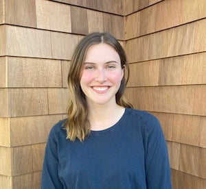
Mia Giglietti ’23, of West Hartford, Connecticut, who is majoring in political science and economics with a minor in Spanish, will analyze economic literature over the 20th century to look at the elite interconnections among corporate boards and their links with governmental bodies to see how those connections benefit those corporations.
“I wanted to participate in this because I’ve always wanted to learn more about how corporations and economic/political corruption work to maintain the power of major corporations and the wealthy,” said Giglietti, who is working with Assistant Professor Nina Eichacker. “I think it is crucial to understand those concepts in the era of severe income inequality that we are currently living through.”
Samantha Murphy ’22, of Cumberland, who is studying applied economics with a minor in music, will work with Associate Professor Smita Ramnarain to compare public health disasters with other types of disasters, looking at how health disasters, such as the COVID-19 pandemic, interact with other crises and social inequalities, and how they have gendered impacts.
“I wanted to do this research project because of my growing interest in heterodox economics,” said Murphy. “The fellowship is giving me the opportunity to do research under the guidance of a faculty member who is well-versed in the fields that I am interested in further studying after my undergraduate time at URI.”
Jason Phillips ’23, of Barrington, Illinois, who is majoring in English, journalism and writing and rhetoric, will be looking at how aware students are of the way colleges and universities treat adjunct faculty. Phillips plans to interview students around the country over the summer on their understanding and feelings about the issues with plans to publish a research paper.
“I chose to research this because, for a large part, adjunct faculty are treated poorly, yet students do not often understand the problem,” said Phillips, who is working with Professor Carolyn Betensky. “I am passionate about understanding how students truly feel about how their professors are treated at their universities.”
Abigail Dodd ’22, of Wakefield, Rhode Island, a history and gender and women studies major, will identify primary sources from URI Distinctive Collections to document the changing role of women—students and faculty—at URI between 1950 and 1980. Her research will create a content module on women that will be used in the course “The URI Campus: A Walk Through Time.” Faculty mentor: Senior Lecturer Catherine DeCesare, with assistance from Karen Morse, director of Distinctive Collections.
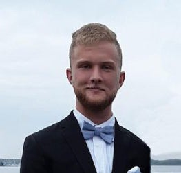
Kevin Hart ’22, of Wakefield, Massachusetts, who is majoring in political science and history with a minor in economics, is researching right-wing terrorism in the U.S. and the motivation behind it. “I wanted to research the topic because it is an under-researched case of political violence but an important one with important implications,” he said. “Working with Assistant Professor Brendan Skip Mark will give me the guidance and experience I need to develop a worthwhile and academically sound project.”
Sierra Obi ‘21, of Danville, New Hampshire, who is majoring in computer science and Spanish, is working on a project exploring computer authentication difficulty faced by people with upper extremity impairment —part of National Science Foundation-funded research being conducted by Assistant Professor Krishna Venkatasubramanian. Obi is working to understand the reasons and circumstances around who people with the impairment share their personal computing devices and credentials with in an effort to improve login security.
Alfred Timperley ’23, of East Greenwich, who is majoring in computer science and data science, will be working on a project to develop a novel tool that will enable future research into program classification source code authorship, plagiarism detection, malware identification, and others. Faculty mentor: Assistant Professor Marco Alvarez.
Ethan Wyllie ’22, of North Kingstown, who is majoring in political science and Spanish, is researching racial inequality in welfare participation. He will track participation rates by different groups—Whites, Blacks, Hispanics, and immigrants—at the state level over the past 20 years to determine racial disparity in U.S. social safety net coverage. Faculty mentor: Associate Professor Ping Xu.