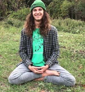
Aggregate Output and the Price Level

Output

At the center of the economic system is the production of goods (automobiles, appliances, computers, books...) and services ( legal aid, education, medical care...). The production of these goods and services satisfies the demands of the households as well as providing them with the income to make their purchases. It is therefore not surprising that measures of performance in the output market are among the most widely studied macroeconomic variables. In fact we might say that economists and policy officials have become preoccupied with output measures - although in recent years we have seen the revival of interest in some alternative measures. Output measures are routinely analyzed to answer questions such as: How fast is the economy growing? Are we in a recession? How does the standard of living of an average American in 1993 compare to the standard of 1893? of 1953? to the standard in Japan, Germany, or Mexico? The answer can be found in the National Income Accounts that we will discuss later (When and by whom are the data published? )

It has not always been that way.  In fact in 1931 as the Great Depression deepened, some leading experts were assembled before Congress and asked to answer some basic questions about the economy - questions they could not answer because they had very little data.  Congress attempted to remedy that situation when it assigned Simon Kuznets the task of developing a system of national income accounts.  The system has evolved and out of these early accounts emerged THE central measure of the economy's size - GDP.   Those older than 40 grew up with gross national product (GNP), but you are likely to hear more about gross domestic product (GDP). GDP has become the primary economic measure used in analyses of economic growth and inter country comparisons of standards of living. GDP focuses on the economic activity within the 50 states, while GNP focuses on the economic activity of a nation's factors of production. The movement away from GNP to GDP, reflects the globalization process currently underway. As the international sector of the US economy expands, it is beginning to resemble that of the other developed countries which have used GDP as their measure of output. In this sense the move toward GDP is comparable to the move toward the metric system, a move toward a common yardstick, although care must be taken when making  intertemporal and international comparisons.

And make no mistake, size matters. Bigger is definitely better, and when this accounting system was merged with Keynes' macroeconomic theory, GDP became enshrined as a key barometer of economic prosperity.  It became generally accepted as a measure of economic well-being although Kuznets, the designer of the accounting system, warned against just such an idea - an issue we will discuss later in some more detail (What's in and what's not in GDP? ). The focus of attention on this single indicator generated a good deal of demand for the services of economists to report the GDP finding, interpret them, and eventually to forecast them.  It also tended to emphasize the importance of spending and focused attention on the short-term.  As Keynes saw it, spending was at the center of the economy and, if necessary, government could use its spending to ensure that full employment was achieved - but that is a subject we will touch on later. 

Before we look at the data, however, we must recognize that GDP figures can change from year to year either because prices change or because output changes and we must determine a system to  account for price changes (inflation). To separate out the two effects there are two separate estimates of GDP - one which is based on current prices (nominal or current $ GDP), and one that is based on constant prices, (real GDP or constant $ GDP).  In the first diagram below we have the level of GDP which indicates the long-term upward trend in GNP (almost the same thing as GDP). We can also see the two very pronounced deviations from the trend: the 1930s when output was below the trend and the 1940s when it was above the trend.

wpe6.gif (4738 bytes)

To get a better handle on the cyclical movements, the GDP data was converted to annual percentage change. In this diagram the most striking feature is the change that takes place in 1950.  If we look before that period, volatility in output tends to be higher with years in which output increased and decreased by nearly 20 percent - far higher than anything that we see in the post 1950 period.  Comparing these data with the inflation data, we find the pre W II era the volatility of GNP was matched with a volatility in the inflation rate - GNP expansions matched by inflation, and recessions matched by deflations.  In the post WW II period, meanwhile, the greater stability in output was accompanied by sustained, and less volatile, inflation.

wpe7.gif (7835 bytes)

When we talk about the value of production, there are three approaches to measuring it:  who produces itwho earns the income generated in the production process, and who buys it. Of the three approaches, the expenditure approach is by far the most popular, due in large part to Keynes' emphasis on aggregate demand. This emphasis is reflected in the national income identity mentioned in the introduction, which is at the center of most macroeconomic analysis. This identity simply states that the value of what is produced (GDP) equals the value of consumption spending (C), Investment spending (I), Government spending (G), and net foreign spending ( X - M)). 

GDP = C + I + G - M

Of these components, the largest and the most stable, is Consumption spending which averages approximately 60 percent of total output. Included here are expenditures by households on durables ( autos, appliances), nondurables ( food, clothing..), and services ( education, health, legal...). Expenditures on durables are the most volatile, while expenditures on services are the most rapidly growing.

The second component of aggregate demand is Investment spending, a relatively small but volatile component of aggregate demand. In the 1990-91 recession, for example, investment spending declined more than 10 percent while consumption spending declined only .6 percent. It is no surprise that economists have looked at this component of demand for keys to an understanding of the dynamics of business cycles. Investment spending is also important because investment spending represents the annual additions to the nation's capital stock, one of the primary inputs used to produce goods and services. As we will see later, this means that an increase in investment has both a supply-side and demand-side effect.

The largest component of investment spending is business spending on plant and equipment, the new factories, offices and machinery that help make US workers the most productive in the world. Also included here is investment in residential construction which tends to be quite volatile. Again looking at the 1990-91 period we find that investment in residential construction declined 12.8 percent, nearly twice the rate for business investment. The final component of investment spending is inventory investment, a residual term that ensures that total demand equals total supply. For example, if GM produces too many cars and these cars pile up on the lots of dealers, then they are counted as inventory investment, cars that GM produced to be sold at a later date. Inventory investment also tends to be quite volatile, but more importantly it is recognized as a leading indicator in the economy. If for example, inventories are rising, this suggests that aggregate demand is inadequate and that a slowdown in the economy as production will need to be cut back to bring demand and supply in line.

The third component of aggregate demand represents federal, state, and local government spending. What may be surprising, at least in light of the controversy surrounding the budget deficits, is the fact that the government's share of aggregate demand in 1990 was 20 percent - approximately the same as it was in 1950. It may also be surprising to find that spending by state and local governments has been rising more rapidly than federal spending, and that since 1970 state and local spending has exceeded federal spending.

Part of the seeming disconnect between what is, and what we expected, can be traced to the fact that government spending on currently produced goods and services such as the spending on police, fire, education, courts, and highways, which in 1991 totaled $1.1 trillion, is only a portion of total government outlays. In addition to the expenditures on these goods and services the government also spends money on a wide array of transfer programs, dollars that are simply moved between individuals. Examples of this would be social security, unemployment, and welfare payments. Total government outlays in 1991 were $2.38 trillion, more than twice the level of government spending.

The final component of aggregate demand is net export spending, the value of exports minus the value of imports. In the past 40 years, exports and imports have expanded rapidly as the US economy has become more integrated into the world economy. Of the two, imports have been growing more rapidly, so a trade surplus of .4 percent of GDP in 1950 has been transformed into a net deficit of nearly 1 percent of GDP. This pattern has caused considerable concern in Washington on the issues of competitiveness of American workers and unfair trading practices.

For a detailed study of the peculiarities of national income accounting you might check out the Frumkin and Sommers books or any of a number of macroeconomics texts. If you want to check out the most recent data you should check out the BEA's web page.  In the remainder of this section we will examine briefly some of the more important issues in national income accounting. We will also examine prices in the economy, looking at how we measure the price level and/or the cost of living. At the end of the section you should better understand what these terms are actually measuring, how to avoid being misled by a misuse or misinterpretation of the numbers, and how the economy has performed in the post W.W. II era. This should help you in your study and evaluation of competing macroeconomic theories, better prepare you for evaluating current government policies, and help you make better choices.


Price Level and Inflation

Even the most casual observer of the news has heard stories about the cost of living, price levels, and inflation, but experience has indicated that name recognition does not translate into an understanding of what these concepts are - and what they are not. To help understand the concepts, we will look at a simple example designed to estimate changes in the cost of entertainment, but first we will look at the concepts and the historical track record.

To begin our analysis it is useful to accept the fact that there is considerable ambiguity surrounding the concept of cost of living.  For example, what do we mean when we ask: what has happened to your cost of living in the past five years?  Cost of living can change because you change what you are buying, or because the prices of what you buy are changing. This should sound quite familiar to you.  As with GDP, there is a need to separate out the two effects because these two changes have very different implications.  An increase in expenditures due to the fact that you are buying more is likely to be viewed as a positive change, while an increase in expenditures due to an increase in prices will be viewed as a negative. 

It is the latter of these measures that economists have been interested in over the years.  According to Persky (1998), an Italian named G. R. Carli writing in the 1760s was the first person to formalize a measurement of the price level when he took an average inflation rate of three commodities - grain, wine, and oil.   In 1780 Massachusetts established the first documented case of a formal price index to use as a basis for payments to soldiers whose earnings were being adversely affected by the changing value of currency.  

As you look at the various measures that have been devised to measure changes in the price level / cost of living, it is important to make the distinction between the price level and the inflation rate.  The price level is a measure of the buying power of money at a point in time, while the inflation rate is a measure of the change in the price level between two points in time.  

The most widely cited measure of the price level is the CPI (Consumer Price Index) published monthly by the Bureau of Labor Statistics (BLS).  The CPI was developed during WW I by the federal government to provide cost-of-living increases to shipbuilders at a time where prices were rising rapidly. (Remember that Massachusetts' first index was also constructed to help pay soldiers during a period of steep price increases). The publication of the index began in 1921 and since then the index has been updated five times.  If you want to see how the inflation indexing works, you might want to check out the inflation calculators

A review of the graph below suggests that in the US the price level as we entered the Great Depression in 1930 was little different from what it was in 1820 - what appears to be a sustained period of price stability.   Since the Depression, however, things have changed considerably with the price level rising continuously.

wpe4.jpg (12037 bytes)

A somewhat different image emerges when we examine the inflation rate which is defined as the percentage change in the price level for a one year period.  What becomes clear when we look at the graph below is that the period prior to WW II  was characterized by periods of inflation (rising prices) and deflation (falling prices) - hardly what would be described as a period of price stability.  In the late 19th century the US experienced a decline that led to the famous Cross of Gold campaign of William Jennings Bryan, and this was followed in the early 20th Century with a period of low inflation. 

wpe6.jpg (16150 bytes)

In the Post 1930s period, meanwhile, the period of sustained increases in the price level was actually a mix of inflation and disinflation (declines in inflation rate). There was a sustained upward trend in the inflation rate - accelerating inflation - that extended from the 1950s through the end of the 1970s.  This trend was abruptly reversed in early the early 1980s, however, and later we will attempt to identify the factors responsible for this sudden defeat of inflation.

What also becomes apparent in this diagram is the two positive spikes - one during WW I and one following the lifting of price controls after WW II - and the two negative spikes - one following the end of WW I and one marking the early stages of the Great Depression. The magnitude of the spikes, as well as the deflation, are both missing when we look at the period after 1950. 

The most thorough treatment of the CPI appears in the BLS monthly publication, The CPI Detailed Report. [You should check out the Entertainment Price Index for a simple example that highlights the construction of a price index]. This report provides data on the national, regional and metropolitan area CPIs, plus a breakdown of prices by expenditure categories such as transportation, food, medical care. You can also find a considerable amount of information on the web.  The BLS web page has a link to Most Requested Series which will lead you to a CPI site that includes links to articles concerning the changes that were put in place in 1998 and the historical data.  You can also check out their Frequently Asked Questions site which offers answers to a number of questions including: What is the CPI?, How is the CPI used?, Is the CPI a cost-of-living index?, Whose buying habits does the CPI reflect?, What goods and services does the CPI cover?, How is the CPI calculated?, How do I read or interpret an index?, and Which index is the "Official CPI" reported in the media?

In truth, there are two separate CPIs, the CPI-U representing urban households and the CPI-W representing only urban workers employed in blue collar occupations. The first of these is the more broadly defined measure and the one that is generally referred to in discussions of the price level and inflation. The CPI differs from the GDP deflator primarily in terms of the composition of the market basket. The GDP deflator is based on basket of goods and services produced in the country, while the CPI is based on the market basket of goods and services consumed by households. The CPI market basket is based on a survey of household spending patterns conducted periodically by the BLS.  The eight major components of the index and some examples from each are:

There are also some notable exclusions from the CPI.   The two most important would be taxes and investments.  According to BLS, the " CPI excludes taxes not directly associated with the purchase of consumer goods and services (such as income and Social Security taxes).  The CPI also does not include investment items (such as stocks, bonds, real estate, and life insurance)." This latter exclusion we will discuss later when we examine the link between money and inflation.

Major revisions of the market basket are undertaken approximately every ten years to reflect changes in the composition of the goods and services that households purchase.  As BLS says in its explanation for the CPI revisions: "New expenditure weights improve the CPI because consumers change their purchasing patterns in
response to many long-term factors. Without updates the index would overweight many now infrequently purchased items, such as domestic service and phonograph records, and underweight many newly important items, such as adult day care and computer software." 

In addition to the decennial revisions, the BLS has also made a number of changes in the index. These changes have been made to reduce the inherent bias in the CPI and we can expect that the debate and the revisions will continue.  According to  John S. Greenlees and Charles C. Mason: "Numerous issues remain, however, all generally resulting from the dynamic nature of U.S. consumer markets—new goods, new types of outlets, increases or decreases in product quality, and consumer substitution behavior." ( Monthly Labor Review)

If you are interested, you can see what the actual changes have been.  BLS has a site with a general overview of the changes that have been made since 1966, a site with a brief summary of the changes, and a site with detailed list of changes in the market basket.  At the present time, the weights and composition of goods and services used in constructing the CPI are based on a survey of household spending in 1993-95, the last year BLS conducted the survey. 

The BLS also publishes data on the inflation rate for the individual categories that make up the market basket.  As you can see in the diagram below, there tends to be a similarity in the inflation rates because they are subject to the same macroeconomic influences - something we will look into in macroeconomics.   What is also very clear from the diagram is the magnitude of the OPEC-induced oil price shocks in 1973 and 1979 when the inflation rate in the fuel category exceeded 15% and the extent of the collapse in the mid 1980s.  Also evident in the graph is the above average rate of inflation in the medical care category.

wpe13.jpg (22740 bytes)

How good is the CPI as a measure of the price level?   This was a question which surfaced in the mid 1990s, but it was not the first time the validity of the index had been called into question.  During World War II the BLS's Cost of Living Index ( later to become the Consumer Price Index) had become a hot topic because it was an input in labor negotiations. The value of the index helped determine workers' wages (Persky 1998), and according to organized labor, the index underestimated price increases due to the existence of rationing, black markets, and the deterioration in quality - an underestimate some thought reached 50 percent.  A commission was formed, and after a review of the data, they reported that the overestimate was only 5 percent.

If you fast forward to the mid 1990s you find that once again a commission had been established to look into measurement problems with the CPI - the Advisory Commission to Study the Consumer Price Index established by the Senate Finance Committee and chaired by Michael Boskin. The pressure toward revisiting the CPI this time was that some people had suggested that the CPI was overestimating inflation and this overestimate had a rather large influence on the finances of the federal government. 

This committee delivered its final report to Congress in December of 1996. The Commission identified: a "substitution bias (due in large part to the fixed-weight nature of the index), outlet bias (which may occur if the benefits to consumers from switching to discount outlets are not accounted for in the index), quality change bias (which results when the quality differences between the goods priced in two consecutive periods cannot be accurately measured and deducted from the accompanying price difference between the goods), and new product bias (due to the failure to reflect adequately the value to consumers of new products that are introduced into the market)."

What did the Boskin Commission conclude? "Using empirical evidence and the members' own judgments about the magnitude of these biases, [the commission] concludes that the CPI overstates the true cost-of-living change by 1.1 percentage points per year."  

While this may seem to be a rather small difference, because of the power of compounding it can have an enormous impact on the level of spending on programs such as social security where spending is indexed to the cost of living. Greenlees and Mason provide an estimate of the magnitude when they report that "It is estimated . . .  that in fiscal year 1996, each 1-percent increase in the index produced a $5.7 billion increase in outlays and a $2.5 billion decline in revenues."  It will also have a substantial impact on the adjustments needed to convert nominal to real quantities.  If the CPI overestimates inflation, then the measures of inflation-adjusted wages would be underestimated as some of the wage increases would be mistakenly attributed to price increases.  If wages grew 4% and the official inflation rate was 5%, real wages would be reported to decline by 1%.  If the actual inflation rate was 2.9%, then real wage growth would be growing at a rate of .1 percent a year.  

Which brings up the question: What was the other agenda in the Boskin commission?  The approaches of the two price level commissions were quite different, and on most of the major issues, the two commissions took opposite positions.  The similarity was in their conclusions.   According to Persky, the "net effect was that the recommendation of the Mitchell commission served to defend the government from paying workers more to compensate them for wartime inflation, and the recommendations of the Boskin committee have served to argue that the government should index a lower rate of inflation, and thus pay less in retirement benefits and collect more in taxes.  A cynic might conclude that economists as a group are committed to a political agenda aimed at limiting the demands that indexation may make on the public purse."   For those interested, you might want to check out the BLS response to the Boskin Commission's report. 

Before leaving our discussion of the CPI, let's return to our initial question: what has happened to the cost of living?  At this point you should realize that we have no answer to that question - which is why the Boskin Commission report included a suggestion that the BLS redesign its CPI.   Nordhaus (Measuring the CPI, 1998) has gone further and suggested that there are some real problems with the use of the proposed modified CPI as a measure of cost-of-living that are not adequately captured with even the proposed revisions to the CPI.  He cites the existence of what he calls "tectonic shifts" in technology that make it extremely difficult, if not impossible, to measure quality-adjusted price indexes and provides evidence on the cost of lighting.  Where the CPI estimate of the price rises from 1800 to 2000, he suggests that the price has actually fallen 95 percent.  He also suggests that public goods should be included in the index, and there may also be instances of a deterioration in the quality of life.  


Note: There is actually a second measure of the price level.   A second measure of the price level is based on the price deflator that emerges from the previously discussed calculations of Real GDP. You will recall the formula P = N/R which provides us with one measure of the price level - the GDP Price Deflator.  The obvious question here is: How sensitive is the inflation rate to the approach taken?   As you can see in the diagram below, however, there is little significance in the differences between the CPI measure and the GDP deflator measures of inflation, so we focus our attention on the CPI.

wpe5.gif (7108 bytes)