Use panels to provide a deep, visual context for a particular topic. A panel is different from a card in that a panel may include multiple links or buttons. Panels are suited to teasing a story, showcasing a program, or highlighting an important initiative.
Overview
Here’s an example panel:
Expeditions
Each year, we conduct more than a dozen expeditions around the world. In pursuit of our research goals, teams travel to some of the remotest regions and endure some of the harshest conditions on the planet.
Our discoveries have advanced the fields of climate change, plate tectonics, and thermodynamics.
Go ExploringPanels contain an image and accompanying text and actions, like links and buttons. Unlike cards, panels may contain multiple links and longer, more descriptive text. By default, text appears on the left-hand side and the image appears on the right-hand side, but this layout can be reversed. On mobile devices, panels adopt a stacked layout similar to cards, with the image appearing above the text block.
Images in panels are automatically cropped to best fill the space provided. The panel’s height is determined not by the image, but by the amount of content in the text area. On mobile devices, where panel content is stacked, the image will be displayed according to its original aspect ratio, without cropping.
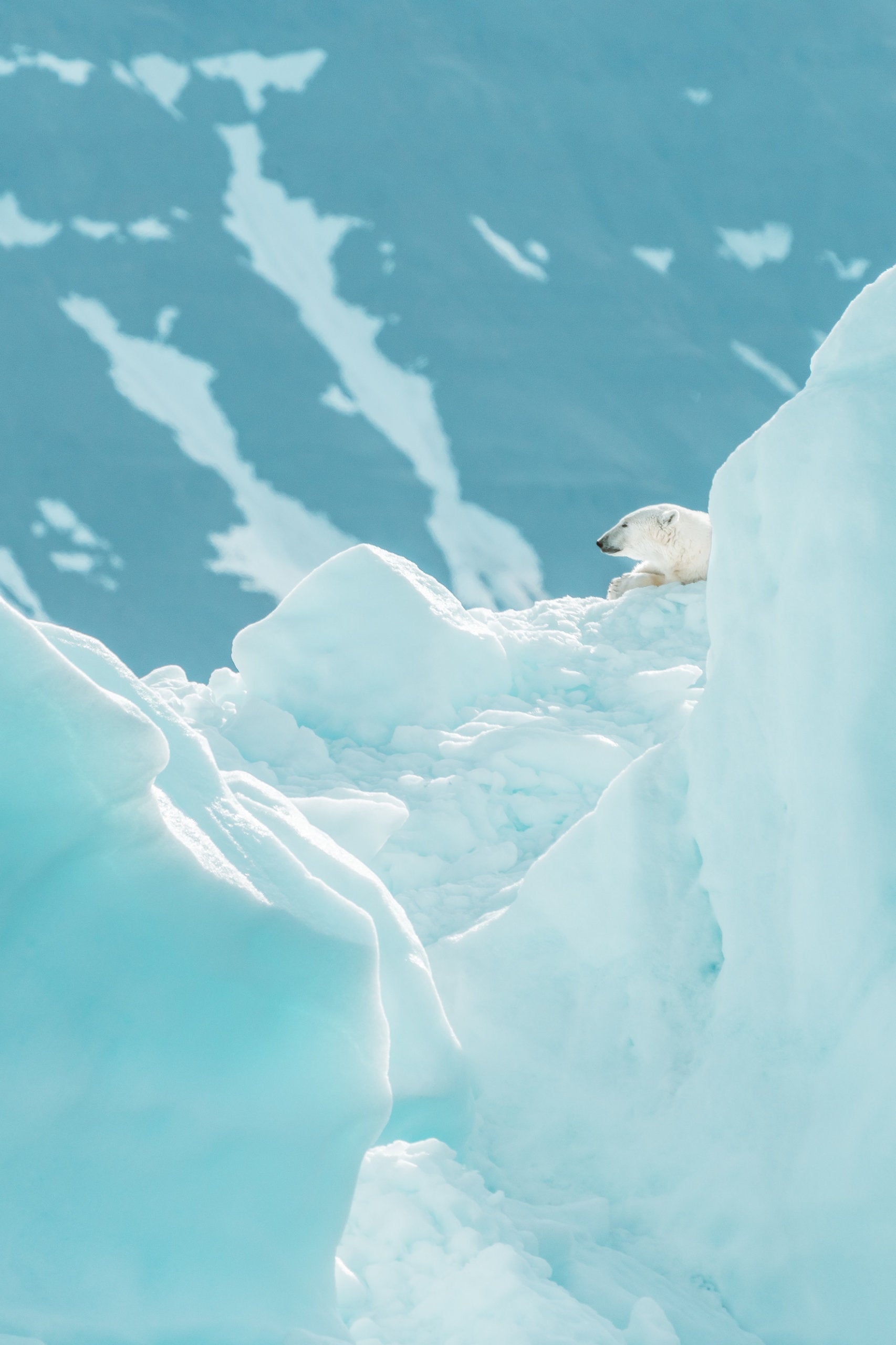
For a more dramatic presentation, panels may be formatted as “super”:
Expeditions
Our discoveries have advanced the fields of climate change, plate tectonics, and thermodynamics.
Go Exploring“Super” panels are full-screen components and are best suited for use with vertical images, though any image will work. As with default panels, the arrangement of text and image may be reversed, and content will appear stacked on mobile devices.
Adding a Panel
On sites using the Block Editor, panels ( ) can be added from the block library, under the Component Library section. Panel content can be edited directly, and options can be set in the sidebar.
On sites using the older Visual Editor, panels can be added by choosing the Panel pictograph ( ) from the editor’s toolbar. Use the editor dialogue to add content and adjust options. To edit the panel later, double-click the panel preview to show the editor dialogue again.
Technical Details
Panels can be implemented with the shortcode cl-panel.
[cl-panel title="Expeditions" img="my_image.jpg"]Some body text.[/cl-panel]
Panels can contain nested shortcodes, like buttons.
Attributes
img
(string) (required)
The source URL for the image
alt
(string) (optional)
Set alternate text for the image
(default value: WP media value)
title
(string) (optional)
The text for a title
(default value: none)
reverse
(bool) (optional)
Set to reverse the panel layout
(default value: false)
format
(string) (optional) (values: default, super)
Set the format of the panel
(default value: default)
class
(string) (optional)
Set custom CSS class(es)
(default value: none)