Use tabs to display content that has a correlation but is not directly related. The tabs themselves serve as an information architecture for the page, so ensure that there is a common thread that holds them together.
When in doubt, avoid using tabs. A cardinal rule of web design is “Don’t hide content” because visitors will not find it. Tabs break that rule.
Overview
Here’s an example set of tabs:
Apples
Here’s some content about apples.
Each tab should elaborate on a particular subtopic that relates to an overarching theme, set of steps, or otherwise common thread. Tabs can include multiple paragraphs, lists, links, images, and other components, like buttons and cards.
Learn moreOranges
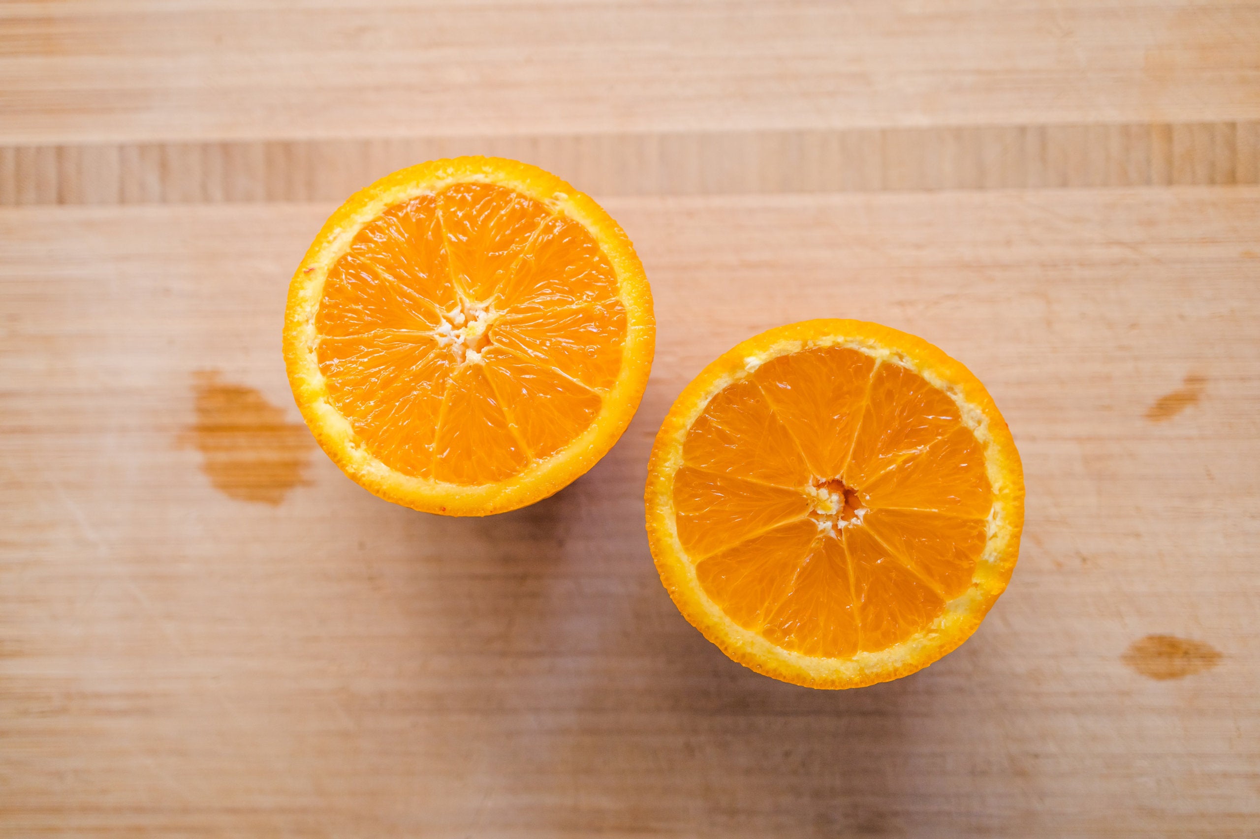
Here’s some content about oranges.
Each tab should elaborate on a particular subtopic that relates to an overarching theme, set of steps, or otherwise common thread. Tabs can include multiple paragraphs, lists, links, images, and other components, like buttons and cards.
Bananas

Here’s some content about bananas.
Each tab should elaborate on a particular subtopic that relates to an overarching theme, set of steps, or otherwise common thread. Tabs can include multiple paragraphs, lists, links, images, and other components, like buttons and cards.
Tabs should not be the lead element on a page, instead, a context for them should be established. Tabs should never exceed 7 items, and they should not be the primary means to discover information.
Adding Tabs
On sites using the Block Editor, tabs ( ) can be added from the block library, under the Component Library section. Tab content can be edited directly, and options can be set in the sidebar.
On sites using the older Visual Editor, tabs can be implemented by using the shortcode (see the below documentation).
Technical Details
Tabs require two shortcodes: one to create the tabs container, and one for each tab/section. The section shortcodes are self-closing and are nested inside the container shortcode, which is enclosing.
Tabs can be implemented with the shortcode cl-tabs.
[cl-tabs][/cl-tabs]
Attributes
class
(string) (optional)
Set custom CSS class(es)
(default value: none)
Add sections to the component with the shortcode cl-tab.
[cl-tab title="My Tab"]Tabs are great – when they’re accessible![/cl-tab]
The tab shortcode supports nested shortcodes, which makes adding other components, like buttons, easy.
Attributes
title
(string) (optional)
The text for the tab and section title
(default value: none)
id
(string) (optional)
Set custom ID for the section. Anchoring to this ID will open section.
(default value: none)
class
(string) (optional)
Set custom CSS class(es)
(default value: none)
Nest the cl-tab shortcode(s) inside the cl-tabs shortcode.
[cl-tabs]][[cl-tab title="Tab 1"]Tab 1 content.[/cl-tab][cl-tab title="Tab 2"]Tab 2 content.[/cl-tab]…[/cl-tabs]